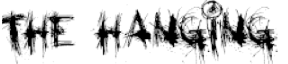
From the analysis of the existing film
posters and magazines, it suggested to me that they have both sans serif and
serif fonts to reflect the different time settings or plot line.
This font has a smudging, dripping effect
similar to how blood would be if someone wrote with it. Blood is normally
associated with death, which reflects the genre we chose for the trailer.
This font has a smudged effect, which is
linked to one of the elements within the film trailer where Mai sees a
distorted image of the ghost figure through the steam.
This font looks like it has been scratched
on which links to one of the elements within our film trailer where Mai wakes
up with scratches from her dream.
Trajan pro will be the one used within our film trailer, this would be effective for the film poster as it will keep the font consistent.
This font has a mixture of scratching and
smudging, which links to both of the elements within the film trailer mentioned
above.
The colour scheme of black, grey, white and red. Black is associated with death, mystery and evil which directly links to the genre of the film as well as the storyline, grey connotes mentally unsettling and gloom which reflects the emotions of the witness within the film trailer, white connotes purity as the murder victim was innocent. The bright pop of red connotes danger which reflects the horror-thriller film genre and it will also stand out from the darker colours.
The colour scheme of black, grey and white connotes death, mystery, evil, mentally unsettling, gloom and innocence within the ghost before her death. It contains the major themes running throughout the film trailer.
The colour scheme of black ,grey, white and olive green which connotes death, mystery, mystery, evil, mentally unsettling, gloom, innocence within the ghost before her death and which connotes peace. Although peace does not directly link to the genre, it links to what the ghost wants from her haunting, to rest in peace after the truth has been revealed.
From analysing two film magazine covers i have found out the symbol of the cross is commonly used near or on cover-lines, they also like adjusting the colour scheme depending on the film they are featuring to suit the characters on the cover. Both of the magazine covers used sans serif font which signifies masculinity, this suggests that the films are mainly aimed at males. For Empire magazine there was very few cover-lines but on Film magazine there was an even amount on both sides, this suggests that Film magazine aims for a younger target audience that tend to judge a magazine how interesting the content will be. Similar to the film posters Empire uses a close up of the face and focus of the eyes in the centre of the magazine which again reflect the characters emotions and intentions. Both of the magazines had cover-lines/headlines across the bottom of their page it makes it most memorable as it is the last thing the reader sees according to the route of the eye.
From analysing the two film posters of the same genre I have found out that rhetorical questions are commonly used as tag lines to question the audience to get them thinking more about the film, both the woman in black and orphan focuses on the eyes of the character on the poster as they are said to be "windows to the soul" and also people say that you can peoples emotion and intentions from looking at the eyes. The two posters use different fonts, sans serif and serif to reflect the different time settings. The posters tend to be very dark or have a background colour that connotes the characteristics of the main characters. The title of the films tend to be at the bottom of the film poster, following the route of the eye it is the last thing seen and the most memorable to the viewers. Both of the film posters i analysed tend to focus on the faces of the character by using mid shots and close ups.